
Oshikatsu & Apparel: Reading Graphic Placement, Garment Colors, and Planning in Uniqlo's Manga UT Photos
When incorporating elements of a favorite series or character into what you wear, sometimes you are looking for a special piece meant exclusively for an event venue, while other times you want something you can wear naturally during everyday outings and errands. How you choose a garment depends on subtle details: which scenes or motifs draw you in, how the artwork is positioned on the fabric, and the color of the shirt itself.

Using official announcement materials released by Uniqlo in 2026 for the “Manga UT Shueisha 100th Anniversary Collection” and the “Pokémon 30th Anniversary UT 2nd Collection” as our starting point, this article organizes what you can read from published product photos regarding garment colors and graphic sizing, alongside a step-by-step process for checking specifications that photographs alone cannot reveal. In the second half, we shift perspectives to consider specifically what kind of information corporate planners and retail merchandisers can provide so that fans can choose their items without hesitation.
Cross-Title Lineups and Theme-Based Art Directions in Official Announcements
When apparel brands collaborate with creative works, some projects bring multiple titles together side by side, while others explore a single franchise through contrasting artistic approaches. Let us begin by looking at the frameworks behind two officially announced examples.
The first example is the “Manga UT Shueisha 100th Anniversary Collection (in Japanese),” announced by Uniqlo on January 15, 2026. Timed to mark the milestone of publishing house Shueisha’s 100th anniversary, the project was introduced as a plan to release roughly 100 designs in total over a period of about two years. Announced as the first wave for release on March 16, 2026, was a lineup of 22 designs spanning 11 manga series (MEN’S T-shirts, priced at 1,990 yen). Rather than all roughly 100 designs hitting store shelves at once, these 22 designs across 11 series represent the initial installment of a phased rollout across multiple periods. While the announcement notes that the shirts will be sold at stores nationwide and through the online store, it also explicitly states that the number of designs offered may vary depending on the country or region.
The second example is the “Pokémon 30th Anniversary UT 2nd Collection (in Japanese),” announced on a Uniqlo special feature page for release on July 24, 2026. Unlike the Shueisha 100th anniversary project that crosses multiple manga properties, this collaboration divides its artistic expression across different product lines under the shared theme of Pokémon’s 30th anniversary. Specifically, the announcement introduces men’s designs using monochrome pixel art from the original video games alongside kids’ designs that take that same pixel art as a foundation and add vibrant color—building on the shared motif of game sprites while varying the color palette and target line.
Simply placing these two examples side by side shows that apparel planning can take at least two distinct paths: an approach that brings a wide range of titles together in the uniform format of a T-shirt, and an approach that presents a single origin point through contrasting graphic treatments such as monochrome versus full color. Although these are examples from one specific company and its particular projects rather than universal rules governing all oshikatsu (fan support activities) apparel, they offer helpful clues when fans set out to choose clothes.
Where to Look in Product Photos: Color, Graphic Placement, and Lineup Scope
When looking at officially released visuals, what details should fans pay attention to in order to find a shirt that fits how they plan to wear it? Here, we will walk through a concrete way of reading product imagery based on the visual published in the press release for the “Manga UT Shueisha 100th Anniversary Collection.”
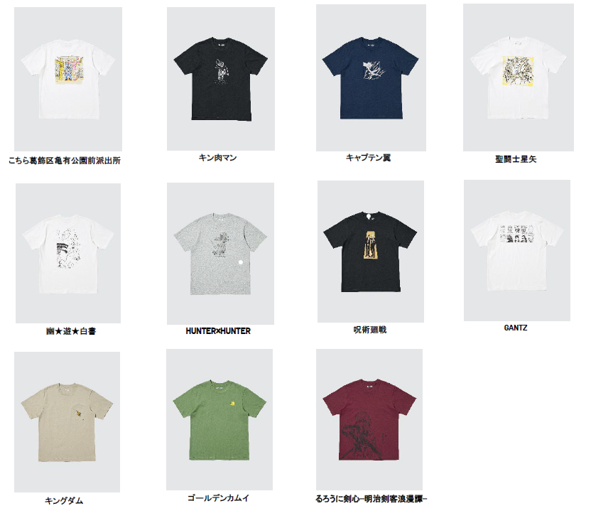
In this image, one T-shirt from each of the 11 series announced for the first wave is arranged side by side, with the title of the respective work listed beneath each shirt. The first point to keep in mind when looking at this visual is that the 11 shirts pictured here are representative samples—one selected from each series—meaning that not all 22 designs from the first wave are shown in this single grid. To find out whether your favorite series has only the single design pictured here or whether alternate designs exist, you need to check the individual lineup for all 22 designs rather than judging solely from the overview image.
With that scope in mind, observing the 11 T-shirts lined up in the photo reveals two major visual differences.
1. Differences in Impression Created by the Garment Color
The base colors of the T-shirts shown in the image are not limited to standard staples like white and black. Different body colors are used depending on the series, including navy, gray, beige, green, and burgundy (maroon). Fans can choose a shirt based on colors that already make up much of their everyday wardrobe or blend easily with their existing bottoms and jackets, or they can use their oshi color (the signature color associated with a favorite character or member) or a shade that evokes the atmosphere of the series as their guide.
For instance, a shirt with a white or beige base pairs easily with light-colored pants or skirts, whereas black, navy, or gray slips smoothly into outfits built around muted, understated tones. Garment bodies that serve as accent colors—such as green or burgundy—readily become the centerpiece of an outfit when worn on their own, and let the wearer enjoy color contrasts when layered under an open shirt or cardigan.
2. Differences in Graphic Size and Placement
The other major difference lies in the surface area and position of the printed graphic. Comparing the shirts in the image shows that some place a large illustration, manga panel, or title logo near the center of the front, while others position a small motif as a subtle accent on the left chest.
A design with a large graphic across the front clearly communicates the presence of the character or scene when worn as a single layer. It suits days when you want to put the visual of the work itself front and center, or occasions where you want to wear a jacket open to showcase the central graphic underneath. By contrast, a design positioned small on the chest reads from a distance almost like a solid-colored T-shirt, revealing itself as a series motif only when someone is up close. This understated format is easy to reach for when you want to work an item into your daily wardrobe in the spirit of a concept outfit (gainen kode—everyday styling inspired by a character’s motifs or palette without looking like overt merchandise), or when you want a balanced look where the print is neither completely hidden nor overly loud under an outer layer.
Furthermore, as seen in the second wave of the Pokémon 30th Anniversary UT collection, when the same pixel-art subject matter is split between a “restrained monochrome treatment” and a “color-added treatment,” your choice will vary depending on which aspect of the original work appeals to you. Whether you want to keep the monochrome texture that feels close to your memories of the original game screen, or enjoy the vibrant impression of full-color characters, the specific shirt you should pick changes even within the exact same franchise.
Large Front Graphics & Signature Colors
- Clearly conveys the visual or scene of the series when worn on its own
- Distinctive base colors like green or burgundy easily become the centerpiece of an outfit
- Suited to wearing under an open jacket so the central graphic remains visible
Small Chest Motifs & Understated Colors
- Looks like a simple garment from a distance and blends easily into everyday outings
- Base shades like white, black, navy, gray, and beige pair easily with existing clothes
- Monochrome treatments and small-area motifs incorporate series elements subtly
Why It Matters to Check Specifications That Photos Cannot Show
After reading the garment color and front graphic placement from an overview image, it is essential to check the detailed specifications on individual product pages or in person at a store before making a purchase or deciding where to wear the piece. There are four clear, practical reasons to investigate garment specifications rather than judging by photo appearance alone.
First, photographs cannot tell you the texture of the fabric, its thickness, how well it holds up to washing, or how it fits when worn. Even among T-shirts lined up within the exact same collection, not every item necessarily uses the exact same fabric weight or printing method. Whether a shirt is opaque enough to wear on its own in the summer, whether it feels bulky when layered, and whether washing it at home requires turning it inside out or using a laundry net must be judged by checking each product’s specifications and care label—and examining the physical item if possible.
Second, a front-facing photo alone may not show the back design or fine construction details. Even when the front appears to feature only a small chest emblem, it is not uncommon for a shirt to have a large illustration or text printed across the back. Checking back-view images is a crucial deciding factor depending on whether you want to show off a back print at a venue as part of an event outfit (sansen-fuku—special attire worn to attend concerts or fan events), or whether you are looking for a shirt that remains nearly plain on the back so you can wear it while running errands on the way home from work or school.
Third, category labels (such as MEN’S or KIDS’) are a separate matter from the body types that can actually wear the garment. For example, the first wave of the Shueisha 100th Anniversary Collection is listed as “MEN’S T-shirts,” while the second wave of the Pokémon 30th Anniversary UT collection features different art directions for its men’s and kids’ lines. However, there is no need to assume that “because it says MEN’S, it is exclusively for men,” or “because it says KIDS’, only children can wear it.” The silhouette of a T-shirt on the body is determined by its actual finished measurements: body width, shoulder width, garment length, and sleeve length. By measuring a shirt you normally wear and comparing those numbers against the official size chart, you can make a concrete judgment on whether to wear a smaller MEN’S size for a tailored fit, intentionally choose a larger size for a relaxed silhouette, or see if the largest KIDS’ size fits your frame.
Fourth, information in press releases reflects the time of announcement and does not guarantee inventory or sales conditions at every store. Just as the Shueisha 100th Anniversary Collection announcement notes that “the number of available designs may vary depending on the country or region,” your nearest store will not necessarily carry every size of all 22 designs at all times. If you have your eye on a specific print, checking online stock indicators and store-by-store availability in advance helps prevent the disappointment of making a trip only to find the item isn’t carried there.
Preparation Steps for Fans Choosing a Shirt for Each Occasion
Bringing together the perspectives covered so far, when fans want to bring an apparel collaboration item into their daily lives, walking through the following checks in order makes it much easier to choose with confidence.
- 011. Grasp Overall Plan & Target DesignsCheck official pages to see which wave it is and whether photos show all designs or samples
- 022. Select Color & Graphic PlacementMatch the garment color and front, chest, or back graphic size to where you plan to wear it
- 033. Check Measurements & Care LabelsCompare actual size charts regardless of gender labels, and review fabric and care instructions
- 044. Verify Store Availability & Release DateCheck the release date, price, and store or regional stocking differences in advance
For example, if you plan to wear the shirt on the day of an event or to a gathering with fellow fans of the series, choosing a design with the title logo or an iconic scene printed large across the front—or picking a body color like green or burgundy that reflects the series’ image—makes the shirt an easy conversation starter during photo ops and interactions at the venue. Conversely, if you want to wear it subtly while commuting, doing everyday shopping, or heading out on a weekend, choosing a design with a small chest motif or a restrained color palette like monochrome pixel art—and picking a size that lets you layer a button-down shirt or cardigan smoothly over top—makes it easy to adjust your look to fit the setting.
Moreover, how many shirts you buy or how much money you spend is never a measure of how deeply you care about a work. Even when a collaboration is a long-term, multi-item project spanning roughly 100 designs over about two years, there is no obligation to chase every release; carefully selecting the single piece that genuinely fits your lifestyle and taste is what leads to wearing it comfortably and happily for a long time.
For Planners: Connecting the Long-Term Plan with Details on Each Garment
What corporate planners can take away from these examples is the importance of clearly distinguishing between the overall master plan and the scope of a specific release. In the announcement for the Shueisha 100th Anniversary Collection, both the two-year plan for roughly 100 designs and the first wave’s specific scope of 22 designs across 11 series are clearly laid out.
Overview photographs serve the valuable role of letting fans compare a wide array of titles and garment colors at a single glance. Once a fan moves to the stage of choosing an individual item, however, they need front and back photographs, close-up images of the print, fabric composition, finished measurements, and care instructions. For that reason, it is helpful to structure promotional pages so that visitors can move smoothly from an overview page surveying the whole project directly to the detailed specifications for each individual shirt.
Alongside category labels like MEN’S and KIDS’, providing size charts that allow shoppers to compare garment length and body width is equally essential. Ideally, a retail presentation should make it easy for anyone looking for clothes that fit their personal styling to verify both their favorite graphic and the exact garment dimensions in one place.
Related articles: What Is Oshikatsu Marketing? / What Are Concept Outfits (Gainen Kode)? / What Are Event Outfits (Sansen-Fuku)? / What Is an Oshi Color?
FAQ
What should I look for in product photos when working a character T-shirt into everyday outfits?
Start by checking the base color of the garment (such as white, black, navy, gray, beige, green, or burgundy) along with the position and size of the graphic. Whether the shirt features a small chest emblem or a large front print changes how it looks both when worn on its own and when layered under an outer garment.
On what scale was the first wave of Uniqlo's 'Manga UT Shueisha 100th Anniversary Collection' announced?
In the press release dated January 15, 2026, Uniqlo announced plans to roll out roughly 100 designs in total over a period of about two years, with the first wave of 22 designs across 11 series (MEN'S T-shirts priced at 1,990 yen) scheduled for release on March 16, 2026. Note that the number of available designs may vary depending on the country, region, or individual store.
Even within collaborations for the same character or franchise, how do designs vary across series or product lines?
For example, in the second wave of the Pokémon 30th Anniversary UT collection announced for release on July 24, 2026, different artistic expressions are used to match the target line and theme—such as a men's line featuring monochrome pixel art from the original games, and a kids' line that takes that pixel art as a base and adds color.
What details cannot be judged from product photos alone and should be checked on individual product pages before buying?
You should check the fabric material and thickness, care instructions, finished garment measurements such as body width and length, and whether there is a print on the back. Rather than judging solely by the labeled category (such as MEN'S or KIDS'), it is also important to compare the actual size chart against clothes you already own.
What information should companies planning and announcing apparel collaborations clearly communicate to fans?
Beyond the release date and price, when a project spans multiple waves, companies need to clearly separate the overall master plan from the scope of the current release, clarify whether overview images show every design or only representative samples, and provide front and back views, exact measurement charts, and store availability conditions.


