
Planning Oshikatsu Cosmetics: Packaging and Retail Design in Official Sanrio and Precure Releases
Cosmetics featuring character artwork on their packaging and beauty items built around an oshi color—a fan’s favorite character or member’s signature color—straddle two worlds at once. They are collectible fan merchandise meant to be displayed and admired, yet they are also everyday personal care items used during morning routines. For product planners in cosmetics and beauty goods, collaborating with an intellectual property (IP, such as a character or media franchise) creates a valuable entry point, prompting consumers who might not normally visit a brand’s cosmetics counter to stop and pick up a product.

At the same time, makeup and fragrance products are practical goods that touch the skin directly, need to be washed off afterward, and get carried around in bags. If a planning team moves forward relying solely on character illustrations and world-building, practical communication challenges quickly emerge on the sales floor: shoppers cannot tell what is inside the box at the store, buyers struggle to distinguish which specific items wash off with water or soap, or customers confuse animated effects from the show with the physical product’s actual functions.
Written for businesses planning and merchandising collaborative products in the cosmetics and beauty sector, this article uses publicly announced product releases and visual packaging details as concrete reference points to examine target audience definition, container and package architecture, set contents, and clear labeling design that keeps shoppers from hesitating at the shelf.
Organizing Cosmetics Collaborations by Who Uses Them and How
When structuring a product plan at the intersection of cosmetics, oshikatsu (fan activities supporting a favorite character or idol), and character licensing, the design priorities become much clearer when you categorize the project not simply by whether to put a famous IP on the box, but by the specific situations in which buyers will use the item and the practical cues they rely on to make a purchase decision.
Broadly speaking, collaborative cosmetics fall into three strategic directions: selecting colors and designs as an extension of a character’s aesthetic or concept coordination (gainen kode) within an existing daily makeup routine; bundling multiple items together as an all-in-one palette for a first-time makeup experience or gift; and recreating the physical sculpting and mechanical gimmicks of items that appear inside a show as functional, everyday cosmetics.
Everyday Makeup Integration
- Center the product on wearable daily shades and standalone item formats
- Reflect the character's color palette and motifs on the container and outer box
- Provide straightforward guidance that appeals to shoppers with established makeup habits
All-in-One Palette and Set Experiences
- Combine eyeshadow, blush, lipstick, and other items into a single box
- Communicate the full set contents at a glance through front window cutouts and visual lists
- Clearly display removal methods and usage precautions right where purchase decisions happen
In-Show Item and Gimmick Recreation
- Incorporate the shapes and moving parts of on-screen transformation items or props into the container
- Clearly distinguish between animated show effects and real-world cosmetic or fragrance functions
- Offer tiered options by budget and use case, such as standalone items alongside pouch bundles
Source: The Oshi Lab's summary of the article
If a team leaves its primary focus ambiguous during the early planning stages, it becomes difficult to settle on how to allocate the container budget or how to structure the information hierarchy on the front of the package. For instance, if you are designing a palette aimed at gift buyers, kids, or entry-level makeup users, two requirements take center stage: shoppers must be able to see the actual shades and item types before opening the box, and the conditions for washing the makeup off must be legible right on the front panel. Conversely, if you are recreating an item from an anime series, your merchandising needs to accurately convey both how the physical gimmick moves and how the item performs as a real cosmetic or fragrance.
Visual Package Information and Set Content Design: The Race × Sanrio Characters Case Study
Let us look closely at the exact pieces of information a shopper reads first when encountering a collaborative cosmetic item on a retail shelf or e-commerce page. Announced on April 13, 2026, via Sanrio Official News on Race Co., Ltd.’s kids’ Makeup Palette (in Japanese), this release features three character variations—Hello Kitty, Cinnamoroll, and Kuromi—scheduled to go on sale starting April 25, 2026, at specialty shops and mass retailers across Japan (priced at 2,970 yen each including tax, with notices that release dates may vary and some stores may not carry the items).
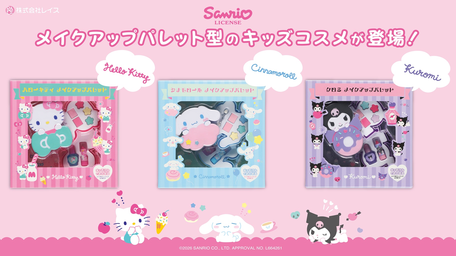
Examining the official product photography reveals several deliberate structural choices designed to assist decision-making on the sales floor, going well beyond simply printing character illustrations onto a cardboard box.
1. Coordinating Character Color Schemes with Custom Palette Silhouettes
In the product photo, the three packages stand side by side, each anchored by the character’s signature image color across the entire outer box: a pink palette for Hello Kitty, a light blue scheme for Cinnamoroll, and a purple motif for Kuromi. Even more noteworthy is what appears through the clear front window: the molded plastic body of the inner palette itself is sculpted into a distinct silhouette for each individual character.
When shoppers—whether children choosing for themselves or adults selecting a gift—scan a store display from a distance, they can immediately spot their favorite character by the distinct color blocks. As they step closer, they can see the unique physical shape of the palette inside. By matching not only the outer box graphic but also the physical molding of the inner compact to each character, the product is engineered so that the character’s recognizable form remains in the user’s hands long after the outer box has been discarded.
2. A Transparent Window Structure That Shows Exactly What Is Inside
Each Makeup Palette set contains three eyeshadow shades, two blush shades, one water-based nail polish, one lipstick, and one eyeshadow applicator tip. Because a large portion of the front packaging consists of a clear plastic window, shoppers can directly inspect the exact shades of the eyeshadows and blushes housed in the palette, the containers for the lipstick and nail polish, and the placement of the applicator tip from the outside.
For entry-level users trying makeup for the first time and gift buyers comparing options, being able to see with their own eyes how many colors and items are inside the box—and what the actual shades look like—serves as vital decision-making information before breaking the seal. Visually, the layout immediately communicates that for the 2,970-yen tax-included price, the kit provides a complete starter assortment covering the eyes, cheeks, lips, and nails.
3. Placing Post-Use Removal Guidance Directly on the Front of the Box
Printed directly on the front panel of the box is a clear notice stating that the makeup washes off with water or soap. For kids’ cosmetics, how easily the product comes off after playtime is just as important a purchasing factor as how cute the character or colors look. On the planning side, teams align the visual sample photography with individual product labeling so that buyers receive consistent guidance.
That said, one cannot judge skin compatibility or specific age suitability from this product photograph alone. Manufacturers and retailers must ensure that buyers can verify full usage directions and safety precautions on the actual physical product labeling.
Connecting In-Show Props with Functional Cosmetics: Bandai’s Pretty Holic Case Study
Next, let us examine a case where items and world-building from an animated series are developed into functional cosmetics and fragrance products. Within Bandai’s Pretty Holic cosmetics line, Cure Eclair’s cosmetic item announced on July 19, 2026—the Top of Lily Fragrance on Bandai Official Topics (in Japanese)—serves as a prime example of bridging an in-show transformation item with a practical, wearable fragrance.
On the official announcement page, Bandai details two versions scheduled for release on July 25, 2026: the standalone Pretty Holic Top of Lily Fragrance (3,355 yen including tax) and the Pretty Holic Top of Lily Fragrance Special Set (5,500 yen including tax), which bundles the fragrance with a matching pouch and accessories.
Separating Gimmick Play Value from Practical Cosmetic Function
The defining characteristic of the Top of Lily Fragrance is that while it functions as an actual wearable fragrance product, the bottle is also equipped with a mechanical gimmick: the sculpted flower part mounted on top of the main body physically rotates.
For fans of the anime and young viewers, having a movable mechanism that mimics the transformation items or detective tools held by characters on screen connects directly to its appeal for role-play (narikiri play) and display collecting. At the same time, because it is a fragrance product applied to the body or personal surroundings, practical explanations detailing what kind of scent product it is and how it should be applied are essential.
Here, the critical point for product planners is crafting consumer guidance that prevents shoppers from conflating animated on-screen effects with the capabilities of the physical item. By clearly separating the visual presentation in the broadcast show from the specifications of the item delivered to the customer’s hands (namely, that the top flower piece rotates and that the bottle holds an actual usable fragrance), planners help buyers accurately understand and evaluate both its sculpted value as a role-play item and its utility as a real fragrance.
Pricing and Bundle Architecture: Standalone vs. Special Set
Furthermore, this release simultaneously presents two purchasing tiers: the standalone fragrance bottle (3,355 yen including tax) and the Special Set that includes a carrying pouch (5,500 yen including tax).
When fans or parents shop for character goods, someone who simply wants to pick up the fragrance bottle itself has a very different target budget and intended use case from someone looking to buy or gift a complete coordinated set that includes a pouch for daily carrying and storage. Preparing a dual-track offering of a standalone item alongside a bundled set during the planning stage is a concrete merchandising technique that widens options on the retail floor.
Why “Washes Off with Water or Soap” Should Never Be Generalized Across All Items
While Bandai’s general brand introduction page for the Pretty Holic line notes as an overarching feature of the kids’ cosmetics series that items can be removed with water or soap, product planners and media communicators must be especially careful not to unconditionally generalize a series-level “washes off with water or soap” description to fragrances, miscellaneous accessories, or collaborative cosmetics from other companies.
Even when products share the same overarching brand banner, makeup items like lipsticks and balms, fragrance products, and bundled fabric goods like pouches all require completely different usage directions and care methods. When consumers actually use an item, they must follow the specific directions and precautions printed on that individual product’s package and instruction manual rather than relying on a general impression of the series as a whole. Likewise, when companies build web pages or in-store point-of-purchase (POP) displays, they need to clearly separate the overarching concept of the series from the specific product specifications and removal instructions of each individual SKU.
Designing the Container and the Consumer Guidance Together During Planning
Looking across these two case studies reveals that planners have multiple touchpoints for integrating a character into a product—across the outer box, the physical molding of the container, the assortment of set contents, and interactive moving parts. Effective planners first define who will use the item and in what setting, and then package the product alongside the exact practical information that the decision-maker needs to see before buying.
- 011. Define Target Audience and Usage ContextDecide whether the item is for kids, gifting, or daily adult use, and identify the primary purchase decision-maker (the user or a parent).
- 022. Lock In Container Molding and Set ContentsFinalize the physical build, such as character-specific colors and palette shapes, rotating gimmicks, or bundled pouches.
- 033. Design Visual Content DisplaysUse clear front windows and visual content lists so shoppers can verify eyeshadow shade counts and included applicators before opening.
- 044. Specify Removal Methods and Scope IndividuallySeparately label how each specific item is used and removed, clearly distinguishing on-screen animation effects from physical functions.
- 055. Communicate Prices, Release Dates, and Retail CaveatsClearly state tax-included prices for standalone and set versions, launch dates, and caveats about store availability or varying release dates.
Source: The Oshi Lab's summary of the article
In the Sanrio palette release by Race, character-specific color schemes, custom palette silhouettes, and a transparent window displaying the full assortment can all be verified on a single package. In Bandai’s Pretty Holic release, the in-show motif, the rotating flower part, the wearable fragrance specification, and the pouch-equipped Special Set are each distinguished and explained in the product guidance.
Both cases offer valuable reference material for thinking through product planning based on publicly announced specifications. Of course, one cannot judge actual sales performance or long-term repeat purchase rates from product photography and release notices alone. Even so, pairing engaging container design with clear, item-specific usage instructions remains essential for building a retail environment where fans and parents can compare options with confidence.
Related articles: What Is Oshikatsu Marketing? / What Is an Oshi Color? / What Is Concept Coordination (Gainen Kode)? / Gen Z Oshikatsu Consumption
FAQ
What are the main planning directions for character and oshikatsu cosmetics collaborations?
Key directions include incorporating characters or signature image colors into everyday makeup items, bundling multiple products into a single palette to offer an accessible first makeup experience, and translating the sculpting and mechanical gimmicks of in-show props into functional makeup or fragrance products. The required container engineering and package labeling change depending on who will use the product and in what setting.
Why is package labeling so important for kids' and entry-level collaborative cosmetics?
Clear labeling allows parents considering a purchase and first-time makeup users to verify both the contents and how to use them before buying. On Race's makeup palettes, a transparent front window reveals the actual items inside, while the front of the box clearly states that the makeup washes off with water or soap. Detailed usage instructions are then guided by each individual product's labeling.
What should product planners keep in mind when turning in-show transformation items or props into actual cosmetics?
Planners need to provide clear guidance that prevents buyers from confusing animated on-screen effects with the real-world functions and specifications of the physical product. As seen in Bandai's Pretty Holic Top of Lily Fragrance, separately specifying the rotating flower-part gimmick, its practical specifications as a wearable fragrance, and the differences between the standalone item and the pouch bundle helps prevent misunderstandings after purchase.
Does a label stating that a product washes off with water or soap apply to every item within a series or palette?
Buyers and planners should never assume from a series name alone that every item can be handled the same way. Because makeup items, fragrances, and pouches serve different purposes, labeling must allow customers to check the specific usage instructions and care guidelines for each individual item.
How should planners separate character popularity from product specifications in a cosmetics collaboration?
While a character's appeal provides the initial spark to pick up an item in a store, whether someone actually buys it and continues using it depends on how convincing the practical specifications are—including set contents, price, removal method, and retail availability. Licensing a popular IP does not automatically guarantee repeat customers or higher sales; specification design and clear consumer guidance tailored to the target audience's daily life are indispensable.


